
Carme Salleras Campo

Un poco de Copy:


CONCURSO "YO DONA" CONTRA LA VIOLENCIA DE GÉNERO-"CICLO DE VIDA DE UN HEMATOMA"
Plata en la VII edición del Concurso de Artes Visuales
contra el Maltrato organizado por YoDona.
Quería romper con el prototipo de cartel contra la violencia de género y hacerlo diferente bajo el claim, "no le des vida, denúncialo". Los colores utilizados pueden verse como los colores de un golpe (hematoma), como una paleta de maquillaje utilizado por la mujer para ocultar un golpe, o como los colores de la vergüenza.
Foto de la entrega de premios (3ª empezando por la izquierda).
_
CONTEST "YO DONA" AGAINST THE GENDER VIOLENCE-“HEMATOMA’S LIFE-CYCLE”
Silver at VII Contest of Visual Arts against Women Mistreatment, organized by YoDona.
I want break with the typicial poster against the gender violence, and make it different below the slogan “Don´t bring life, denounce it”. The colours palette used can be seen like an hematoma’s colours, as a make-up colours used by the woman to hide a punch or as the colours of shame.
Photo of the delivery awards (I am the third beginnig from the left)


HUGO BOSS-"JUST DIFFERENT"
Para el lanzamiento de la nueva fragancia de Hugo Boss "JustDifferent" he creado una campaña ficticia que gira en torno al nombre del producto: JustDifferent.
Para ello se ha creado una serie de carteles con mensajes que rompen un poco los estereotipos de los típicos anuncios de colonia y luego otros con mensajes que incitan a ser original y diferente a los demás, acabando con la frase "no hará que huelas mejor".
Todos ellos contienen un código QR que lleva directamente a la página del blog creado para la ocasión.
_
HUGO BOSS-"JUST DIFFERENT"
For the launch of the new Hugo Boss fragrance “Just Different” I have created a fictitious campaign focused on the product name: Just Different. For this, a series of graphics have been created with messages which break with the stereotypes of the typical fragrance ads and also others with messages which incite originality and being different from the rest, finishing with the sentence "doesn't make you smell better". Each one contains a QR code which takes you direct to the blog page created for the occasion.


DOVE-EL PRETÉRITO (IM)PERFECTO DE TU BELLEZA.
Siguiendo la línea creativa que Dove lleva tiempo realizando con éxito, se han creado unos carteles para exterior que reivindican la verdadera belleza natural de nuestro cuerpo, la cual muchas veces no nos gusta o no nos sentimos a gusto con ella. A partir de una misma estructura verbal (pretérito imperfecto, el pasado), con tono negativo y que es tachada para reivindicar el desacuerdo y las ganas de cambio, surge lo que he llamado el pretérito perfecto (de tu belleza). ¡Nada más y nada menos que el presente! Los diferentes carteles siguen la misma estructura de copy y abajo podemos ver como el “IM” de imperfecto también está tachado. Finalmente se ha añadido el imperativo “Conjuga” para animar a que cada uno haga lo mismo con sus (im)perfecciones.
DOVE-THE (IM)PERFECT PRETERIT OF YOUR BEAUTY*.
Along the successful creative line sets out by Dove over time, some outdoor ads have been created in order to reclaim the truly natural beauty of our body, which a lot of times we do not like it or we do not feel confortable with her. From the same verbal structure (imperfect preterit, the past), with negative tone and crossed out in order to reclaim the disagreement and the willingness for change, appears what I called the perfect preterit (of your beauty). Nothing more and nothing less than the present!. The different posters keep the same copy structure and in the bottom we find that the “IM” of imperfect is crossed out as well. Finally, the imperative of “Conjugate” has been added to encouraging everyone to do the same with their (im)perfections.
*Impossible to translate in English.
MINI-"NO SIEMPRE LO GRANDE ES MEJOR"
Idea de cartel para publicidad exterior del ficticio Mini Little, con un juego de humor con la tarjeta del centro de cirugía genital a partir del cual se construye el copy " No siempre lo grande es mejor"
Fuente de imagen: propia.
_
MINI-“THE BIGGEST IS NOT ALWAYS THE BEST”
Idea for exterior advertisement poster for the fictitious Mini Little, with a joke with the genital surgery centre card and the copy “The biggest is not always the best”. Own source image.


1DEDO DE ESPUMA, 2DEDOS DE FRENTE-TWEETS
Tweets para el concurso 1Dedo de espuma, 2Dedos de frente.
_
1DEDO DE ESPUMA, 2DEDOS DE FRENTE-TWEETS
Tweets for the contest 1Dedo de espuma, 2Dedos de frente.
GREEN PEACE-"AHORA QUE LO CONOCES..."
Cartelería ficticia lanzada por Greenpeace para concienciar a la gente sobre una serie de valores de la organización, tales como el cuidado del medioambiente, la importancia del reciclaje, el desarme...
Cada cartel se pondría en zonas acorde con el mensaje, por ejemplo, el cartel de "Fuego" se pondría cerca de los bosques, el de "Papel", "Vidrio" y "Plástico" cerca de containers de basura, el de "Bala" en la salida de los cines...
_
GREEN PEACE-”NOW THAT YOU KNOW...”
Fictitious posters launched by Greenpeace to make people aware of a series of values of the organization, such as caring for the environment, the importance of recycling, disarmament…
Each poster would be put in zones according to the message, for example, the poster “Fire” will be put near the forests, “Paper”, “Glass” and “Plastic” near rubbish containers, “Bullet” in cinema exits...


ALAIN AFFLELOU-"TE DAMOS LO QUE TE FALTA"
Marquesina ficticia para las ópticas Alain Afflelou. Se utilizarán palabras que caracterizan una buena visión, colocadas en modo de examen de vista con el copy inferior "te damos lo que te falta".
_
ALAIN AFFLELOU-”WE GIVE YOU WHAT YOU ARE LACKING”
Fictitious marquee for Alain Afflelou opticians. Words which define good sight will be used and will appear as an eyesight test.


PANAMA JACK-"PREPARADAS PARA LO QUE PUEDA PASAR"
Anuncio ficticio para vallas publicitarias. El producto al que hace referencia el atributo "preparadas para lo que pueda pasar" son las botas Panama Jack. Imagen simple donde se ven las huellas de unas Panama Jack y las de un animal que, por el tamaño de sus huellas, parece ser grande. En medio sucede una disputa (muchas huellas tanto de la persona como del animal) y parece ser que la persona sale victoriosa. Intenta transmitir el espíritu de aventurero de la marca.
-
PANAMA JACK-“READY FOR WHAT COULD HAPPEN”
Fictitious advertisement for billboards. The product to which “ready for what could happen” refers is Panama Jack boots. A simple image where two sets of footprints can be seen: those of Panama Jacks and those of an animal which, judging by the size of its footprints, seems to be very big. In the middle, a fight between the animal and the person takes place, (many footprints, both of the person and of the animal) and it appears that the person wins. It tries to transmit the adventurous spirit of the brand.

DUREX-"KEEP CALM AND PUT IT ON-"
A partir del famoso póster producido por el gobierno británico en 1939 y redescubierto en 2012, se ha sustituído el "Keep calm and carry on" por "Keep calm an put it on" (Mantén la calma y póntelo). Mediante esta ilustración Durex incide en el uso del condón y realiza una exageración en cuestiones de tamaño.
_
DUREX-“KEEP CALM AND PUT IT ON”
Taken from the famous poster produced by the British government in 1939 and rediscovered in 2012, the "Keep calm and carry on" have been replaced for "Keep calm an put it on". By this illustration Durex incides on the use of condoms and makes an exageration on size issues.

REPSOL-"REPSOLGRAMA"
Cartel pensado para la Responsabilidad Social Corporativa (RSC) de Repsol. La idea se basa en su proyecto Asfaltos Verdes en el cual utilizan el polvo de los neumáticos usados, y que ya no sirven, para construir carreteras. El crucigrama está formado por diferentes partes de neumáticos, que acaban formando la palabra Repsol y abajo se lee "Cuando las piezas dejan de encajar, Repsol tiene la solución"; cuando las piezas dejan de encajar (es decir, cuando los neumáticos ya no pueden utilizarse), Repsol tiene la solución (los utiliza para hacer carreteras).
_
REPSOL-“REPSOLGRAMA”
Poster though for the Corporate Social Responsibility (CSR) of Repsol. The concept is based in their project Green Asphalt where tyres are used to construct roads. The crossword consists on different tyre parts which form the word Repsol and under it you can read "When the pieces stop to fit, Repsol has the solution": When the pieces stop to fit, that is, when the tyres can't be used, Repsol has the solution, that is, they use the tyres to make roads.


DAFONT-"LOS SECUESTRADORES AUN NO CONOCEN DAFONT.COM"
Gráfica para la página de typos (fuentes tipográficas) DAFONT.COM. No hace falta explicar mucho más, si acaso mencionar el guiño de la cantidad monetaria a entregar donde aparecen todos los números, dando a entender que en dafont.com no sólo hay letras sino también números.
-
DAFONT-“KIDNAPPERS DON’T KNOW ABOUT DAFONT.COM”
Graphic for the fonts web DAFONT.COM. It's not necessary to explain anyfurther, maybe mention the monetary quantity wink, where all the numbers appear, making evident that dafont.com also has numbers an not only letters.
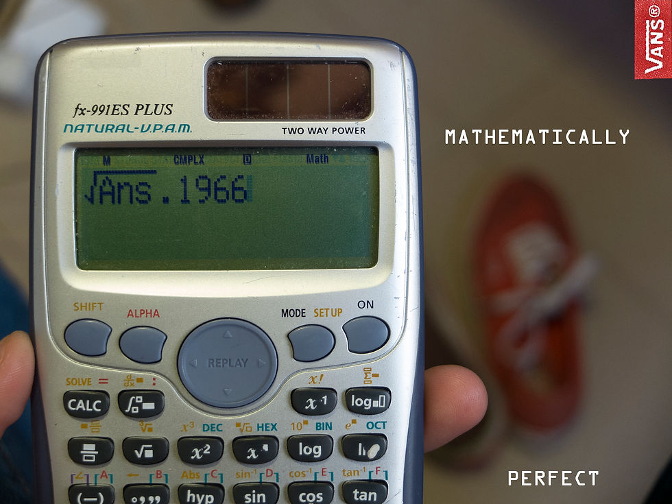

VANS-1º: "MATHEMATICALLY PERFECT"
Juego de palabras entre la calculadora, donde podemos ver que pone Vans 1966 (año de creación), y el texto "Matematicamente perfectas". De fondo se pueden ver unas Vans.(Fotografía fuente propia).
VANS-2º: "SINCE 1966"
1966 fue el año en que se pusieron a la venta las primeras Vans.
_
VANS-1st: "MATHEMATICALLY PERFECT"
Words game between the calculator, where we can see that it says “Vans 1966” (the year of foundation of Vans), and the text “mathematically perfect”. In the background we can see some Vans shoes (Own source image).
VANS-2nd: "SINCE 1966"
1966 was the year when the first Vans were put on sale.


DONUTS-1º:"WHEREVER YOU WANT"
Marquesina ficticia para la marca Donuts. Intenta transmitir que puedes comerte un Donut dónde quieras.
Fuente de imagen: propia
DONUTS-2º: "IGUAL DE REDONDO QUE TU DÍA"
Marquesina ficticia para la marca Donuts.
_
DONUTS-1st: "WHEREVER YOU WANT"
Fictitious shelter for Dounts brand. It tries to communicate that you can eat a Donut wherever you want.
Own source image.
DONUTS-2nd: "IGUAL DE REDONDO QUE TU DÍA"
(Difficult to translate the meaning)
Fictitious shelter for Dounts brand.